April 27, 2020
Behind the Scenes of our Scorecard
By Sarah Giordano, Arundel Rivers Federation
Around this time, each year, we share exciting news about the state of our rivers. Often, we present this in the form of a glossy booklet filled with crisp charts and colorful maps. Many of you, I bet, have been waiting in anticipation to see if the rivers recovered after 2018’s massive rainfall.
Likewise, we 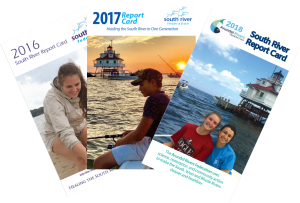 have eagerly been sorting through months’ worth of data, excited to discover what our monitoring efforts have revealed about the health of each of the South, West, and Rhode rivers. An average health score, or grade, for the monitoring season helps to tell us how each of the rivers fared this past year. The data wielded a rather positive story for 2019, but I will let our Riverkeeper, Jesse Iliff, tell the tale this Thursday, April 30th, (more info at the end of this article)- I don’t want to spoil any of the details.
The scorecard might seem like a small thing, but there is a good deal of work that goes into it: 7 months of monitoring, 1 month of data entry, 3 months of data analysis, and 2 months of deliberating over the best way to convey the data to you, our River residents. It is not a small undertaking and the process of turning data into a digestible pamphlet is not always a smooth road. In fact, I have learned to expect more than a few potholes. In the following, I hope to walk you through what we do behind the scenes to get to you that sleek final report.
Monitoring: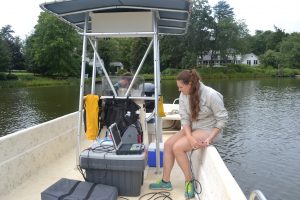
The first and foremost thing we need to do might seem like a no-brainer, but it is by far the most important part of the process. Simply put, we have to collect the data. Easy enough, right? Think again! The physical process of collecting the data itself is relatively straight forward, but managing and making sure the equipment stays in spec can be a bit tricky. When I first started, even with the manual laid out in front of me, I had technical support on speed dial. Once we get the equipment running well, it is smooth sailing!
Cleaning the Data:
After the data is collected and transferred to the computer with the help of our stellar summer interns and volunteers, we need to spend some time organizing and cleanin g the data. This helps to make sure that typos and human-made errors are kept to a minimum. At first, I started to write, ‘this helps to make sure we do not have any errors,’ but like all honest scientific work, it is important to acknowledge your margin of error. Double-checking through data just helps to ensure that ours stays insignificant.
Calculating the Score:
When the data is cleaned and ready for analysis, then we calculate the scores. The process is completed through a series of formulas that evaluate the measurements collected. For most of our parameters, we use a multiple threshold system set forth by the Maryland Tributary Assessment Coalition (MTAC).
This is very different from a single threshold system, under which all your data passes or fails. Under a single threshold system, if 7 out of 10 times dissolved oxygen reads levels over 5mg/L, it succeeds 70% of the time and achieves a passing score. This becomes troublesome, when you have water quality measurements that are close to passing, but don’t quite make the cut. In short, it means that a creek with devastating dissolved oxygen levels, barren to aquatic life, and another creek with fair dissolved oxygen levels, supporting a few tolerant fish species, would be given the same score, because neither meet the criteria to “pass.”
Under a multiple threshold system, each measurement is given a score between 0 and 5. A measurement indicating ideal water quality would be given a 5, a measurement indicating poor water quality would be given a 0, and a measurement indicating fair water quality would be given a score between 1 and 4. These scores are then averaged together and divided by the best possible outcome (5) for a percent score. So using the example above, if a creek had ideal dissolved oxygen levels 7/10 times and fair levels 3/10 times it might actually get a score of 84%. However, a creek that had ideal dissolved oxygen levels 7/10 times and poor levels 3/10 times might get a score of 76%. The multiple threshold method allows for a more comprehensive understanding of our rivers, including the nuances between poor and fair water quality.
Troubleshooting:
Often we will run into some sort of abnormality in the data that will require putting on our sleuthing hats and digging into numbers to find an explanation.
Okay, as an example, maybe I’ll give you ONE spoiler. This past year, we saw that our temperature scores improved in comparison to 2018, indicating cooler measurements. However, 2019’s annual air temperature for the Baltimore/Washington region was slightly warmer than it was in 2018. This was quite the conundrum. How could air temperature rise, but water temperature cool? We had a brainstorming session among staff, and came up with a few different theories.
The first thing we needed to do was to break the data down into small segments (like weeks or months, rather than just looking at a summation of entire monitoring season) to pinpoint the source anomaly. Did the anomaly span across the entire monitoring season? Or is one particular period of time skewing the data? Unlike some of our many other data related puzzles that require far further investigations, this first step was all that was needed. We found that while the overall temperature of the year may have been warmer, water temperatures in two particular months, September and October were much cooler than in 2018, bringing the overall score up.
Telling a Story:
Once the scores are finalized, we can then start summarizing and interpreting the data. Normally, this consists of highlighting major issues or successes observed in the river over the course of the year (i.e. algal blooms or visiting dolphins). It also means comparing data to previous years, which can sometimes be tricky. If you have ever looked in detail at our report cards, you may have wondered about an asterisks under the score table. It normally reads something along the lines of “these scores are not comparable to previous years.” This simply means that because of slight differences in monitoring timeframes, mostly due to inclement weather or malfunctioning equipment, we cannot compare one year’s score to the year prior without limiting to season so as to compare apples to apples (or September to September, versus of September to October). The “change from prior year” column takes varying seasonal periods into account, so instead of comparing 2018’s report to 2019’s, it is better to look at these values to see the difference in change from one year to another.
The last and 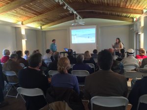 final piece of our scorecard process is the distribution.
We usually reveal our results in the form of an in-person presentation. Unfortunately, due to coronavirus concerns, we won’t have a sit down presentation this year, but we are still dedicated to sharing our discoveries, even if we need to do so virtually.
Click here to learn how to tune in on April 30th, this Thursday, at 7pm.
Click here for a digital version of the report card will be posted on our webpage.